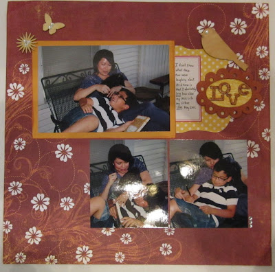
Sometimes it's ok to just put a few pictures down on a pretty patterned paper, add a few accents, and journal. No techniques, no fuss, just another story told in your scrapbook. It's OK to be simple!
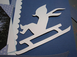
Sometimes you're ready to glue everything down and you go HMMM.... maybe I should.... make that POP a little bit. :) The sledding kid die cut (from Cricut's Snow Day) is plain white and it was just too plain. My title? Too plain as well.
The Cricut cut has layers I could have added, but I really just wanted a sort of shadow here. So, how to fix it up without making it too cluttered and messy looking?
Glimmer Mist, one of the chalkboard colors, on both the cut piece and my cut out title will do the trick! (Title from Robotz cartridge, and banner is from the Jubilee cartridge.) Oh, and a little bit of bling here and there for added dimension and sparkle:
That's what I'm talkin' 'bout. :D
(click to enlarge)
Add pop dots to the title for an extra pop.
I guess I'm sick of summer because at Friday night's crop all I did were winter photos. We don't have a "real" winter here in SA; my sister has taken my kiddo to Ruidoso, New Mexico, for two years in a row, all for the purpose of playing in the snow. My siblings and I grew up in Chicago and we knew playing in the snow. In fact, I remember walking to school when the dang snow was taller than me! :)
This journaling tag is from a swap I participated in years ago. And I mean YEARS ago. I have no idea who made it. I'm just glad I finally found a permanent home for that cutie snow man.
Last summer Nick's best friend had his b-day party at an ice skating rink. Who cares about birthday papers and accents when you can go with more winter-y accents?!! :)
On the above LO, I used a SU! scallop punch for those blue edges. The die cut title is from a Cricut cartridge; I didn't write down which one and I don't remember... The "Thaddaeus" banner is hand cut and the stamps are an old CTMH set. The mittens and all felt accents on all of the above LOs are KI Memories brand, also years and years old.
So, after making about seven winter-themed layouts some summer pictures caught my fancy and I got to work on those. I could never, ever, EVER be a chronological scrapbooker. I go with whatever pictures or paper calls my name!
The PP is Little Yellow Bicycle that I believe it is their line from last summer. I'm still using up the stash here! "Pool Party" was cut from either the H2O Cricut cartridge or the Splish Splash cart, I don't remember which one. The word bubbles on the right-sided page are from the CTMH Artiste cartridge. I added some buttons in the sun die cut (all the plastic die cuts are LYB brand), and the "happy happy" is an accent I made myself a month or two ago.
The journaling block is from Becky Higgin's Project Life. I just cut it down to fit, added some brands and twine and mounted it on the green that's recurrent throughout my two-pager.
Finally, here's a two-pager that I made last week some time. My sister bought Nick a chemistry set and-- be still my beating heart as I minored in Chemistry in college-- Nick LOVED experimenting! I love, love, love that he loves to learn! Especially if it's in the science field!!!
The flask and test tubes are cut from Cricut's Chemistry Icon digital images. I had fun choosing which colors to use on that. "Kaboom" is from the Cricut Disney font and the "boom" icon it's mounted on is from the Office Help cartridge. The PP and die cuts are Jillibean Soup's Atomic Soup, which I believe is a paper line that's either one or two years old.
Would ya look at that face? What's not to love! :) :) :)
Thanks for stopping by and leaving love! I hope everyone has a fantastic week!


Oh these are all good BUT Atomic Soup was my absolute favourite Jillibean set I've got a couple of hoarded scraps left.
ReplyDelete